


Let us build it step by step 😋
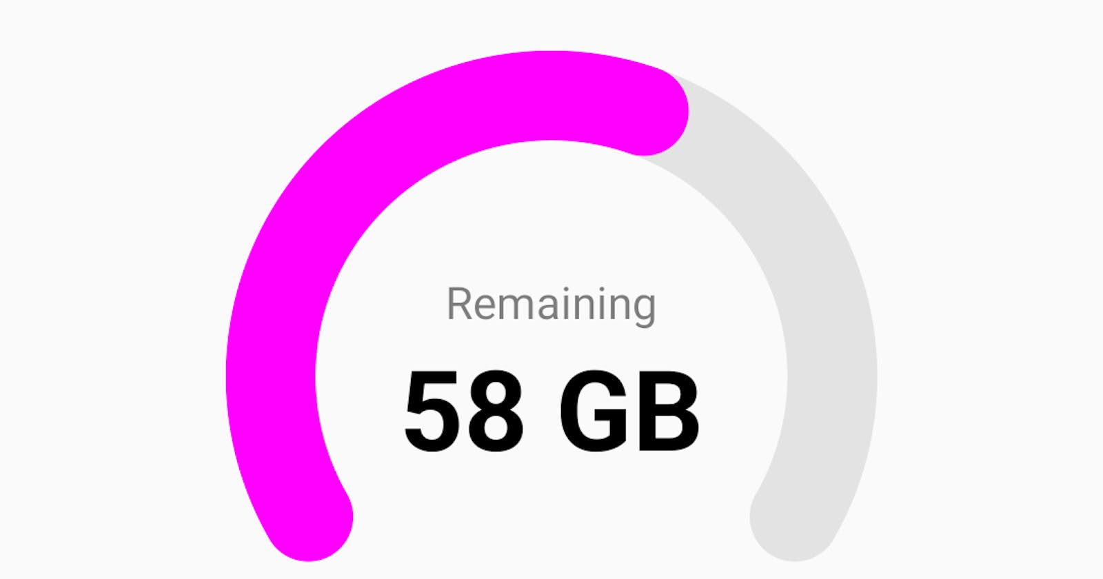
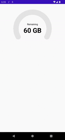
First thing first. See, what we'll be building!
Okay, so as we can see this kind of UI is not provided out of the box in jetpack compose and that's why we choose to build a custom UI component for this use-case.
Let's jump right into it.
2 arc! One changing its angle over time
By observing the UI we can see that there are 2 arcs.
One is in the background which is static and the other one is rotating over it dynamically. So we'll build this much first.
We'll use Jetpack compose canvas to draw the arcs
@Composable
fun NetworkUsageIndicator(
    modifier: Modifier = Modifier,
    backgroundArcColor: Color = Color.LightGray.copy(alpha = 0.5f),
    arcColor: Color = Color.Blue,
    radius: Dp = 100.dp,
    arcStyle: DrawStyle = Stroke(
        width = with(LocalDensity.current) { 32.dp.toPx() },
        cap = StrokeCap.Round
    )
) {
    val localDensity = LocalDensity.current

    val startAngle = remember(Unit) { 150f }
    val targetAngle = remember(Unit) { 240f }

    val radiusPx = remember(radius) {
        with(localDensity) { radius.toPx() }
    }
    val diameterPx = remember(radius) {
        with(localDensity) { (radius * 2).toPx() }
    }

    Canvas(
        modifier = modifier,
        onDraw = {
            drawArc(
                color = backgroundArcColor,
                startAngle = startAngle,
                sweepAngle = targetAngle,
                useCenter = false,
                topLeft = Offset(size.width / 2, size.height / 2),
                size = Size(diameterPx, diameterPx),
                style = arcStyle
            )
            drawArc(
                color = arcColor,
                startAngle = startAngle,
                sweepAngle = targetAngle - 80f,
                useCenter = false,
                topLeft = Offset(size.width / 2, size.height / 2),
                size = Size(diameterPx, diameterPx),
                style = arcStyle
            )
        }
    )
}
This code will draw the following.
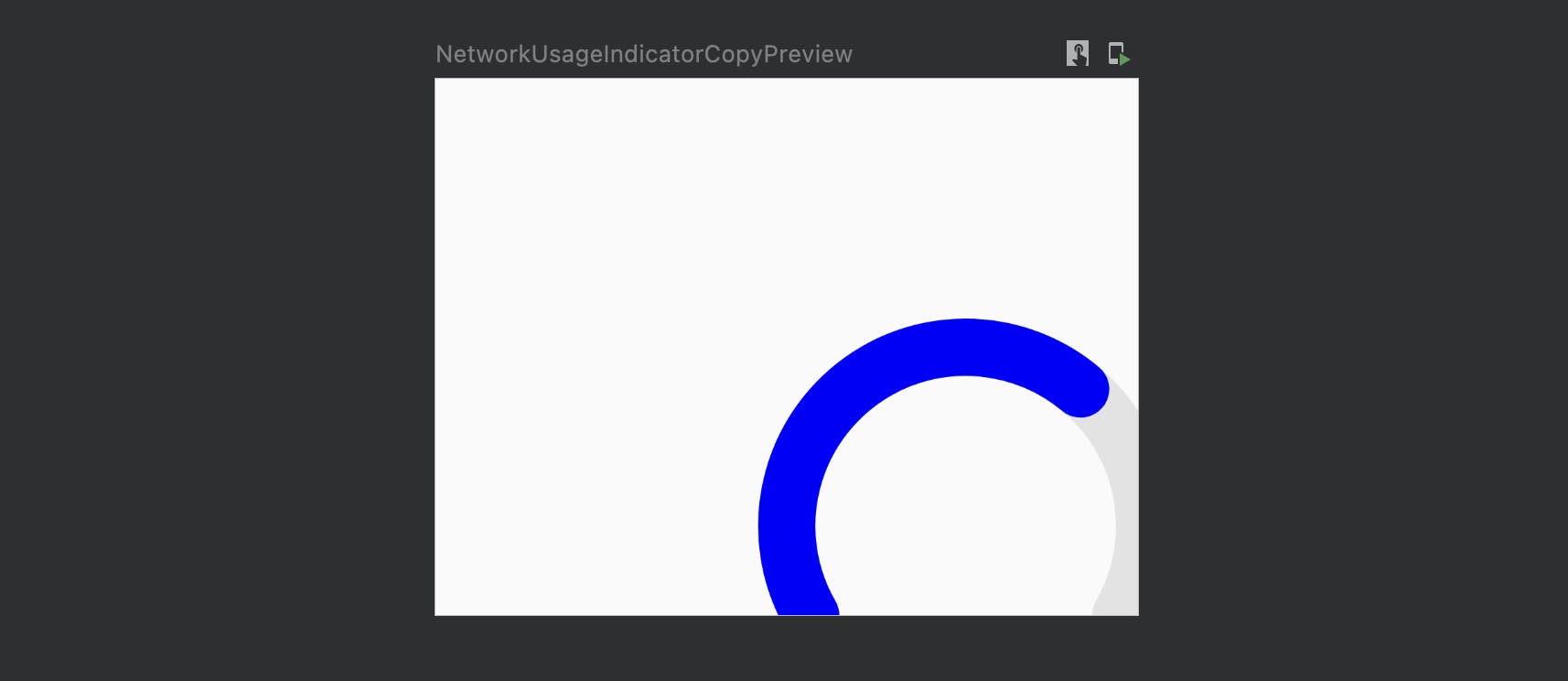
As we can see, it did draw 2 arcs. One over the other since we've used the same Offset value for both. But they are not in the center. Why?
Because the offset we've used to draw them is thistopLeft = Offset(size.width / 2, size.height / 2)
It says from the center move size.width / 2 right, and size.height / 2 down. Because of this arc's center has moved right down.
How to center the arc in the center of composable?
We can just subtract the arc's radius from X and Y offset of both the arcs.
New offset will be
drawArc(
    ....
    topLeft = Offset(size.width / 2 - radiusPx, size.height / 2 -       radiusPx)
    ....
)
drawArc(
    ....
    topLeft = Offset(size.width / 2 - radiusPx, size.height / 2 -       radiusPx)
    ....
)
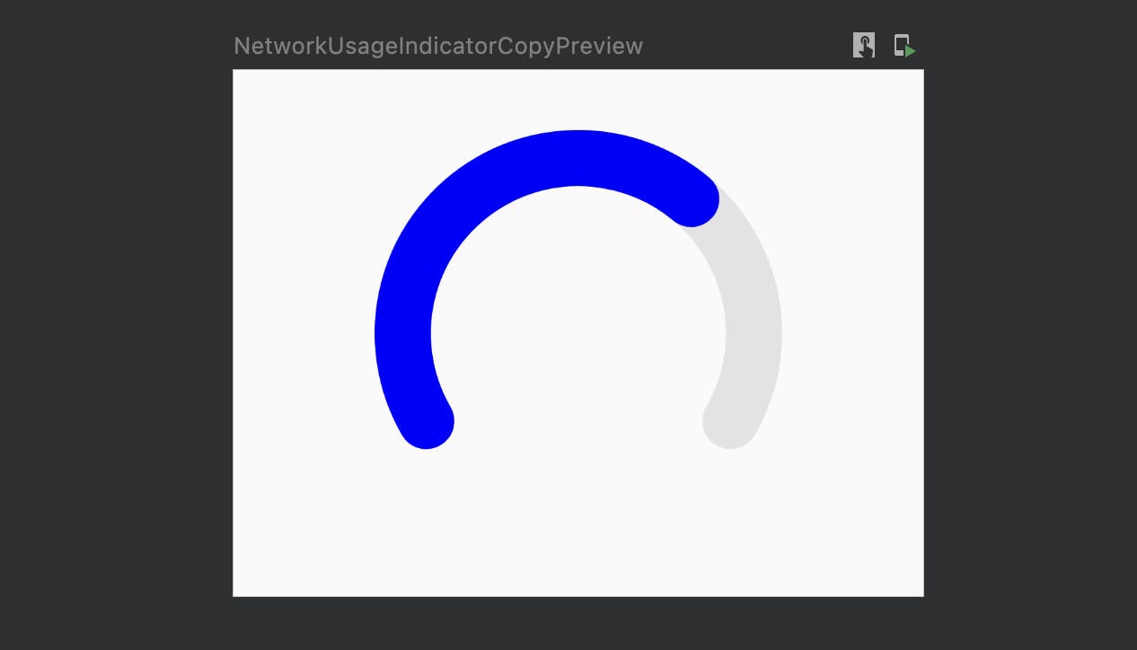
and our arc is now in the center of composable.
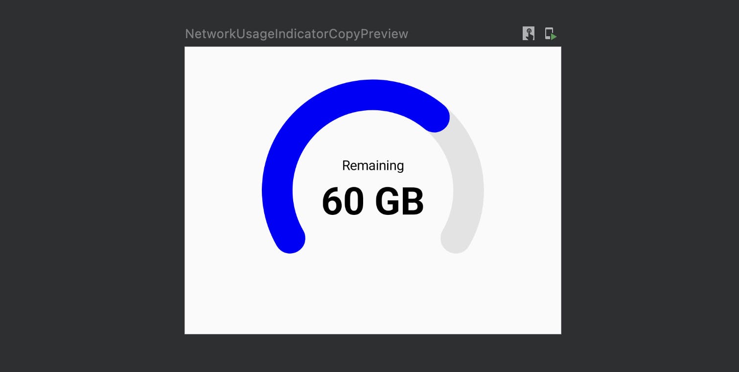
Its time to draw "remaining" and "n GB" text on the Canvas. Here we'll change the approach, instead of manually calculating the offset for text, drawing text and all the complexities we'll use existing Column for that. We'll put these two text in column and draw the arc behind the colum using Modifier#drawBehind modifier.
And we'll take indicator value and maximum indicator value from the function params. Let's write till here.
@Composable
fun NetworkUsageIndicator(
    modifier: Modifier = Modifier,
    indicatorValue: Int,
    maxIndicatorValue: Int = 100,
    backgroundArcColor: Color = Color.LightGray.copy(alpha = 0.5f),
    arcColor: Color = Color.Blue,
    radius: Dp = 100.dp,
    arcStyle: DrawStyle = Stroke(
        width = with(LocalDensity.current) { 32.dp.toPx() },
        cap = StrokeCap.Round
    )
) {
    ....

    Column(
        modifier = modifier.drawBehind {
            drawArc(
                color = backgroundArcColor,
                startAngle = startAngle,
                sweepAngle = targetAngle,
                useCenter = false,
                topLeft = Offset(size.width / 2 - radiusPx, size.height / 2 - radiusPx),
                size = Size(diameterPx, diameterPx),
                style = arcStyle
            )
            drawArc(
                color = arcColor,
                startAngle = startAngle,
                sweepAngle = targetAngle - 80f,
                useCenter = false,
                topLeft = Offset(size.width / 2 - radiusPx, size.height / 2 - radiusPx),
                size = Size(diameterPx, diameterPx),
                style = arcStyle
            )
        },
        verticalArrangement = Arrangement.Center,
        horizontalAlignment = Alignment.CenterHorizontally
    ) {
        Text(
            text = stringResource("Remaining")
        )
        Text(
            text = "$indicatorValue GB",
            style = TextStyle(fontSize = 40.sp, fontWeight = FontWeight.Bold)
        )
    }
}
Now that we've all the things needed to show indicator, it's time to animate the arc.
Animate the arcs
Let's first animate the arc with given static angle then we'll try to make it dynamic based on indicator value.
    ....
    var currentSweepAngle by remember { mutableStateOf(0f) }
    val animatedCurrentSweepAngle by animateFloatAsState(
        targetValue = currentSweepAngle,
        animationSpec = tween(
            durationMillis = 1100,
            delayMillis = 200,
            easing = FastOutSlowInEasing
        )
    )

    LaunchedEffect(key1 = Unit) {
        delay(500)
        currentSweepAngle = 160f
    }

    ....
    // and apply this animated angle to 2nd arc
    drawArc(
        startAngle = startAngle,
        sweepAngle = animatedCurrentSweepAngle,
        ...
    )
As we can see, initially currentSweepAngle was 0 and we changed it to 160 after 500ms of delay to trigger the animation. This is how the animation looks 😎
We are getting close, now that animation is also running fine. Let's try to make it dynamic. For that currentSweepAngle has to change based on indicator value.
We'll use simple range map function. Read more about it here
Range map function will calculate currentSweepAngle based on the indicator value.
Like this currentSweepAngle = (targetAngle * indicatorValue) / maxIndicatorValue So let's replace the earlier LaunchedEffect with below.
LaunchedEffect(keys = arrayOf(indicatorValue, maxIndicatorValue)) {
    currentSweepAngle = (targetAngle * indicatorValue) / maxIndicatorValue
}
With this in place, our currentSweepAngle will now change according to indicatorValue. If indicatorValue is 0 angle will be 0, if it's 100 angle will be 240 which is targetAngle defined earlier, else it'll be calculated.
Next things:
Have inputfield to supply
indicatorValuefrom outsideAnimate "n GB" text
Animate color of "n GB" text when becomes 0
Change arc color
Since, this post is already pretty long. I have decided to split it into another part.
Writing Part 2 soon. The full code can be found on this gist: here
Please comment if you find something incorrect, inappropriate, or didn't understand. I'll try to address
Alright, thanks for reading. Spread if you liked 🌾